Logo collection
Here you can discover some of the logos I’ve designed for cool projects.
The motion broadcast corporation
A meaningful logo was TMBC’s expectation. Something simple, efficient but elegant at the same time.
For this project I’ve had to create two logos. A corporate one, used as secondary logo. And a more creative one as primary logo. For the corporate one, I needed to find the perfect font. As you remember, the key words were: simple, efficient, elegant. I had to find a minimalist font with an interesting bold style.
Regarding the primary one, they wanted a symbol with a signification. And so the symbol’s idea represents the intention Themotionbc is putting in their work: a challenge. Sometimes you have to achieve a lot to reach your goal.
I’ve also work on their website, you can check it out here.
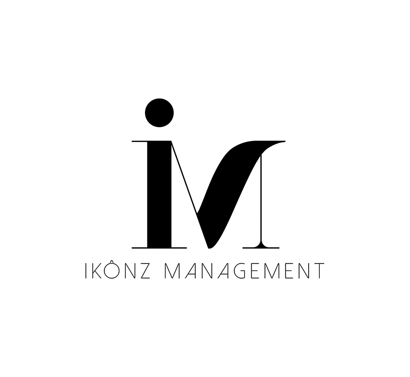
Ikônz Management
As the first model school in French Guyana, Ikônz Management needed
an impactful visual identity.
For this project, I played a lot on deconstruction and letter links. The logo had to be available on several supports. So I took part to put forward the acronym ‘IM’, which allowed several uses of the logo. As a result, I’ve created 3 ways to use the logo.
Of all the proposals submitted, the final choice was this design. For its fashion agency side, due to the curves of the font, and its more graphic side, due to the play between the ‘i’ and the ‘m’.